ไปยังเนื้อหาหลัก

วิธีปรับแผนภูมิแท่งเพื่อให้แท่งกว้างขึ้นใน Excel

บทความนี้พูดถึงการปรับ Bar Chart เพื่อให้แถบทั้งหมดกว้างขึ้นใน Excel ตามภาพด้านล่างที่แสดง

ปรับแผนภูมิแท่งเพื่อทำให้แถบกว้างขึ้นใน Excel


ปรับแผนภูมิแท่งเพื่อทำให้แถบกว้างขึ้นใน Excel

หากต้องการทำให้แถบกว้างขึ้นในแผนภูมิแท่งโปรดทำดังนี้

1. คลิกที่แถบใดก็ได้ในแผนภูมิแท่งและคลิกขวาจากนั้นเลือก จัดรูปแบบชุดข้อมูล จากเมนูคลิกขวา ดูภาพหน้าจอ:

2. ในการโผล่ขึ้นมา จัดรูปแบบชุดข้อมูล บานหน้าต่างย้ายไฟล์ Zoom แถบของ ความกว้างของช่องว่าง ไปทางด้านซ้ายจนกระทั่งความกว้างของแท่งตรงตามความต้องการของคุณภายใต้ ตัวเลือกซีรี่ส์ มาตรา. ดูภาพหน้าจอ

3 ปิด จัดรูปแบบชุดข้อมูล บานหน้าต่าง

จากนั้นคุณจะเห็นแถบในแผนภูมิแท่งที่ระบุกว้างขึ้นตามภาพด้านล่างที่แสดง

สุดยอดเครื่องมือเพิ่มผลผลิตในสำนักงาน

🤖 Kutools AI ผู้ช่วย: ปฏิวัติการวิเคราะห์ข้อมูลโดยยึดตาม: การดำเนินการที่ชาญฉลาด   |  สร้างรหัส  |  สร้างสูตรที่กำหนดเอง  |  วิเคราะห์ข้อมูลและสร้างแผนภูมิ  |  เรียกใช้ฟังก์ชัน Kutools...
คุณสมบัติยอดนิยม: ค้นหา เน้น หรือระบุรายการที่ซ้ำกัน   |  ลบแถวว่าง   |  รวมคอลัมน์หรือเซลล์โดยไม่สูญเสียข้อมูล   |   รอบโดยไม่มีสูตร ...
การค้นหาขั้นสูง: VLookup หลายเกณฑ์    VLookup หลายค่า  |   VLookup ข้ามหลายแผ่น   |   การค้นหาที่ไม่ชัดเจน ....
รายการแบบเลื่อนลงขั้นสูง: สร้างรายการแบบหล่นลงอย่างรวดเร็ว   |  รายการแบบหล่นลงขึ้นอยู่กับ   |  เลือกหลายรายการแบบหล่นลง ....
ผู้จัดการคอลัมน์: เพิ่มจำนวนคอลัมน์เฉพาะ  |  ย้ายคอลัมน์  |  สลับสถานะการมองเห็นของคอลัมน์ที่ซ่อนอยู่  |  เปรียบเทียบช่วงและคอลัมน์ ...
คุณสมบัติเด่น: กริดโฟกัส   |  มุมมองการออกแบบ   |   บาร์สูตรใหญ่    สมุดงานและตัวจัดการชีต   |  ห้องสมุดทรัพยากร (ข้อความอัตโนมัติ)   |  เลือกวันที่   |  รวมแผ่นงาน   |  เข้ารหัส/ถอดรหัสเซลล์    ส่งอีเมลตามรายการ   |  ซุปเปอร์ฟิลเตอร์   |   ตัวกรองพิเศษ (กรองตัวหนา/ตัวเอียง/ขีดทับ...) ...
ชุดเครื่องมือ 15 อันดับแรก12 ข้อความ เครื่องมือ (เพิ่มข้อความ, ลบอักขระ, ... )   |   50 + แผนภูมิ ประเภท (แผนภูมิ Gantt, ... )   |   40+ ใช้งานได้จริง สูตร (คำนวณอายุตามวันเกิด, ... )   |   19 การแทรก เครื่องมือ (ใส่ QR Code, แทรกรูปภาพจากเส้นทาง, ... )   |   12 การแปลง เครื่องมือ (ตัวเลขเป็นคำ, การแปลงสกุลเงิน, ... )   |   7 ผสานและแยก เครื่องมือ (แถวรวมขั้นสูง, แยกเซลล์, ... )   |   ... และอื่น ๆ

เพิ่มพูนทักษะ Excel ของคุณด้วย Kutools สำหรับ Excel และสัมผัสประสิทธิภาพอย่างที่ไม่เคยมีมาก่อน Kutools สำหรับ Excel เสนอคุณสมบัติขั้นสูงมากกว่า 300 รายการเพื่อเพิ่มประสิทธิภาพและประหยัดเวลา  คลิกที่นี่เพื่อรับคุณสมบัติที่คุณต้องการมากที่สุด...

รายละเอียด


แท็บ Office นำอินเทอร์เฟซแบบแท็บมาที่ Office และทำให้งานของคุณง่ายขึ้นมาก

  • เปิดใช้งานการแก้ไขและอ่านแบบแท็บใน Word, Excel, PowerPoint, ผู้จัดพิมพ์, Access, Visio และโครงการ
  • เปิดและสร้างเอกสารหลายรายการในแท็บใหม่ของหน้าต่างเดียวกันแทนที่จะเป็นในหน้าต่างใหม่
  • เพิ่มประสิทธิภาพการทำงานของคุณ 50% และลดการคลิกเมาส์หลายร้อยครั้งให้คุณทุกวัน!
Comments (9)
No ratings yet. Be the first to rate!
This comment was minimized by the moderator on the site
Thank you so much!!! so helpful.
This comment was minimized by the moderator on the site
Also been looking for a way to do this. Line chart over dates/times with bars when data (KGs) increased i.e. new delivery. Rather than change x axis type to text, I ended up having a filled border on bar. Need to select the same color fill as line and then select the border width to widen the bar. Can be done in VBA if chart is being produced with VBA?
This comment was minimized by the moderator on the site
Thanks. Works very well for me. At least I have gotten the bars wider. Easy to learn process. 
This comment was minimized by the moderator on the site
Your articles are life-savers!
This comment was minimized by the moderator on the site
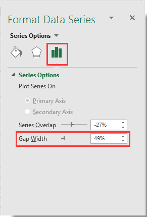
Sorry... this doesn't work on a PC with Office365 2020.10. The control is there but even when set to zero percent for the gap width, the bars are scrawny little narrow bars which will accommodate no text overlay. Something not right.
This comment was minimized by the moderator on the site
Not in office365 but it might work for you, I have found a similar issue with "scrawny" bars on dates that adjusting overlay and gap width don't correct. To fix was as simple as reordering my data from oldest to newest and then changing axis type to "text axis" rather than "date axis" and then adjusting overlay and gap width. Give it a crack?
This comment was minimized by the moderator on the site
Well, that behaviour is brain-dead, but it worked for me too! Thanks.
This comment was minimized by the moderator on the site
Thanks Tom, that was a winner for me
This comment was minimized by the moderator on the site
same for my Office 365...
There are no comments posted here yet
Please leave your comments in English
Posting as Guest
×
Rate this post:
0   Characters
Suggested Locations