ไปยังเนื้อหาหลัก

วิธีสร้างแผนภูมิพร้อมวันที่และเวลาบนแกน X ใน Excel

ใน Excel เรามักจะแทรกแผนภูมิเพื่ออธิบายข้อมูลได้ดีขึ้น แต่ในบางกรณีเมื่อคุณสร้างแผนภูมิคอลัมน์ / แท่ง / เส้นตามชุดวันที่และเวลาแกน X ของแผนภูมิอาจแสดงเป็นภาพหน้าจอด้านล่าง และในบทความนี้ผมจะแนะนำวิธีการแสดงวันที่และเวลาบนแกน X อย่างถูกต้องในแผนภูมิ
แผนภูมิ doc พร้อมวันที่เวลา 1

สร้างแผนภูมิที่มีวันที่และเวลาบนแกน X อย่างถูกต้อง


ลูกศรสีฟ้าฟองขวา สร้างแผนภูมิที่มีวันที่และเวลาบนแกน X อย่างถูกต้อง

ในการแสดงวันที่และเวลาอย่างถูกต้องคุณจะต้องเปลี่ยนตัวเลือกในไฟล์ จัดรูปแบบแกน โต้ตอบ

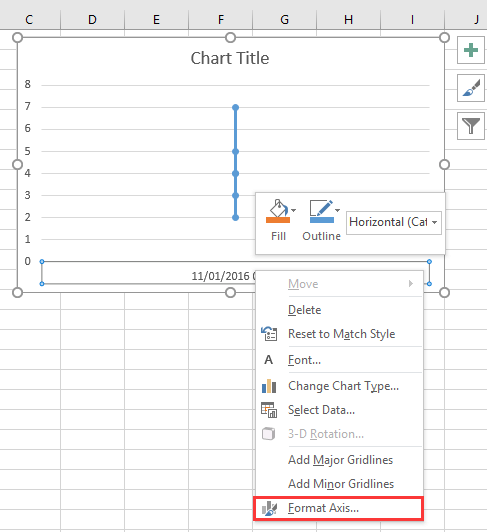
1. คลิกขวาที่แกน X ในแผนภูมิแล้วเลือก จัดรูปแบบแกน จากเมนูบริบท ดูภาพหน้าจอ:
แผนภูมิ doc พร้อมวันที่เวลา 2

2. จากนั้นใน จัดรูปแบบแกน บานหน้าต่างหรือ จัดรูปแบบแกน ไดอะล็อกภายใต้ ตัวเลือกแกน แท็บตรวจสอบ แกนข้อความ ตัวเลือกใน ประเภทแกน มาตรา. ดูภาพหน้าจอ:
  แผนภูมิ doc พร้อมวันที่เวลา 4
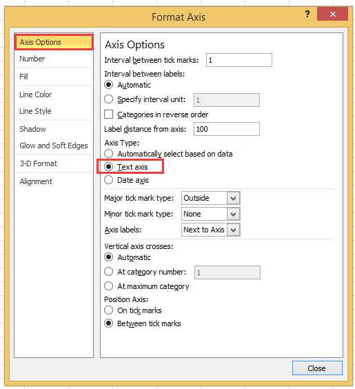
หากคุณใช้เวอร์ชัน excel ที่ช้ากว่าปี 2010 คุณจะเห็นบานหน้าต่างแกนรูปแบบปรากฏขึ้นและเลือกตัวเลือกแกนข้อความภายใต้ประเภทแกนในกลุ่มตัวเลือกแกน
แผนภูมิ doc พร้อมวันที่เวลา 3

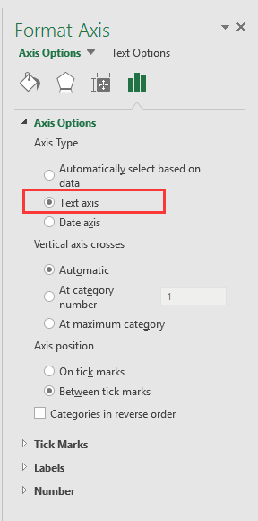
3 คลิก ปิดหน้านี้ หรือกลับไปที่แผนภูมิจากนั้นข้อมูลวันที่และเวลาได้แสดงอย่างถูกต้องในแกน X ดูภาพหน้าจอ:
แผนภูมิ doc พร้อมวันที่เวลา 5


สร้างแผนภูมิมาตรวัดความเร็วด้วยสองขั้นตอน!

บางครั้งคุณอาจต้องการใช้แผนภูมิมาตรวัดความเร็วเพื่อแสดงราคาของโครงการ แต่ใน Excel ในการสร้างแผนภูมิมาตรวัดความเร็วต้องใช้หลายขั้นตอนซึ่งซับซ้อนและเสียเวลา ที่นี่ แผนภูมิมาตรวัดความเร็ว เครื่องมือใน Kutools for Excel สามารถช่วยคุณสร้างแผนภูมิมาตรวัดความเร็วมาตรฐานได้สองขั้นตอนง่ายๆ ดาวน์โหลดเครื่องมือนี้พร้อมทดลองใช้ฟรี 30 วันทันที.
แผนภูมิมาตรวัดความเร็ว doc

สุดยอดเครื่องมือเพิ่มผลผลิตในสำนักงาน

🤖 Kutools AI ผู้ช่วย: ปฏิวัติการวิเคราะห์ข้อมูลโดยยึดตาม: การดำเนินการที่ชาญฉลาด   |  สร้างรหัส  |  สร้างสูตรที่กำหนดเอง  |  วิเคราะห์ข้อมูลและสร้างแผนภูมิ  |  เรียกใช้ฟังก์ชัน Kutools...
คุณสมบัติยอดนิยม: ค้นหา เน้น หรือระบุรายการที่ซ้ำกัน   |  ลบแถวว่าง   |  รวมคอลัมน์หรือเซลล์โดยไม่สูญเสียข้อมูล   |   รอบโดยไม่มีสูตร ...
การค้นหาขั้นสูง: VLookup หลายเกณฑ์    VLookup หลายค่า  |   VLookup ข้ามหลายแผ่น   |   การค้นหาที่ไม่ชัดเจน ....
รายการแบบเลื่อนลงขั้นสูง: สร้างรายการแบบหล่นลงอย่างรวดเร็ว   |  รายการแบบหล่นลงขึ้นอยู่กับ   |  เลือกหลายรายการแบบหล่นลง ....
ผู้จัดการคอลัมน์: เพิ่มจำนวนคอลัมน์เฉพาะ  |  ย้ายคอลัมน์  |  สลับสถานะการมองเห็นของคอลัมน์ที่ซ่อนอยู่  |  เปรียบเทียบช่วงและคอลัมน์ ...
คุณสมบัติเด่น: กริดโฟกัส   |  มุมมองการออกแบบ   |   บาร์สูตรใหญ่    สมุดงานและตัวจัดการชีต   |  ห้องสมุดทรัพยากร (ข้อความอัตโนมัติ)   |  เลือกวันที่   |  รวมแผ่นงาน   |  เข้ารหัส/ถอดรหัสเซลล์    ส่งอีเมลตามรายการ   |  ซุปเปอร์ฟิลเตอร์   |   ตัวกรองพิเศษ (กรองตัวหนา/ตัวเอียง/ขีดทับ...) ...
ชุดเครื่องมือ 15 อันดับแรก12 ข้อความ เครื่องมือ (เพิ่มข้อความ, ลบอักขระ, ... )   |   50 + แผนภูมิ ประเภท (แผนภูมิ Gantt, ... )   |   40+ ใช้งานได้จริง สูตร (คำนวณอายุตามวันเกิด, ... )   |   19 การแทรก เครื่องมือ (ใส่ QR Code, แทรกรูปภาพจากเส้นทาง, ... )   |   12 การแปลง เครื่องมือ (ตัวเลขเป็นคำ, การแปลงสกุลเงิน, ... )   |   7 ผสานและแยก เครื่องมือ (แถวรวมขั้นสูง, แยกเซลล์, ... )   |   ... และอื่น ๆ

เพิ่มพูนทักษะ Excel ของคุณด้วย Kutools สำหรับ Excel และสัมผัสประสิทธิภาพอย่างที่ไม่เคยมีมาก่อน Kutools สำหรับ Excel เสนอคุณสมบัติขั้นสูงมากกว่า 300 รายการเพื่อเพิ่มประสิทธิภาพและประหยัดเวลา  คลิกที่นี่เพื่อรับคุณสมบัติที่คุณต้องการมากที่สุด...

รายละเอียด


แท็บ Office นำอินเทอร์เฟซแบบแท็บมาที่ Office และทำให้งานของคุณง่ายขึ้นมาก

  • เปิดใช้งานการแก้ไขและอ่านแบบแท็บใน Word, Excel, PowerPoint, ผู้จัดพิมพ์, Access, Visio และโครงการ
  • เปิดและสร้างเอกสารหลายรายการในแท็บใหม่ของหน้าต่างเดียวกันแทนที่จะเป็นในหน้าต่างใหม่
  • เพิ่มประสิทธิภาพการทำงานของคุณ 50% และลดการคลิกเมาส์หลายร้อยครั้งให้คุณทุกวัน!
Comments (23)
No ratings yet. Be the first to rate!
This comment was minimized by the moderator on the site
I have the same issue when graphing data that has date AND time: points on the graph are equally spaced, whereas the underlying data has unequal gaps between datapoints. Data is in the form "dd/mm/yyyy hh:mm" formatted as date/time (not text). Data spans multiple days so it's not possible to extract just the time element.
This comment was minimized by the moderator on the site
I have a chart with x-axis in time that stretches during about 6h and 35min. I have data for each 20min in the beginning, then 15min and lastly each 10min. Also, in between I have 45min and 5min data.. The issue that I have, and several others, is that each gap between the date are equally spaced out. Meaning that, even if it is only 5min the gap is the same as if it was 45min.
This comment was minimized by the moderator on the site
i want to make a line graph which contains thousand of entries it's included date, time, month and year, so please help me out.
This comment was minimized by the moderator on the site
Hi, syed Mubashir alam, I do not understand your quetion, if you just create a line graph and the x-axis contains month/day/year hour:minute as below screenshot shown:
https://www.extendoffice.com/images/stories/comments/sun-comment/line-chart-1.png
just follow above steps of the article. If your question is about the axis contents are to long, there is no good idea.
This comment was minimized by the moderator on the site
i want to make a line graph which contains thousands of entries including time, date, month and year but i couldn't make a line graph so please help me out.
This comment was minimized by the moderator on the site
It's good coment that point is not a comma. When you want to add more numericals numbers you should use comma in excel ;)
This comment was minimized by the moderator on the site
Excel menus have changed - this is an out of date article - please update for 2020 .. e.g where is AXIS TYPE now?
This comment was minimized by the moderator on the site
I did not found Excel 2020, just 365 2019, which menus are the same as 2013,2016 version.
This comment was minimized by the moderator on the site
How do I remove days that don't have data in them. Example 8/1-8/31 but not data was captured on 8/3 or 8/4, how do I remove those dates from my graph? They are not in my data table so why is it pulling them?
This comment was minimized by the moderator on the site
Open the Excel file that holds the chart from which you want to exclude dates. Click the X-axis, located underneath the chart, so that it becomes surrounded by a small box. Right-click inside the box and choose "Format Axis" from the popup menu. Click "Axis Options" on the left side of the "Format Axis" window. Locate the three "Axis Type" options in the middle of the screen on the right side of the window. Click the radio button next to "Text axis."
This comment was minimized by the moderator on the site
Hi, I have an issue here. When I opened "Format Axis" and "Axis Options", there is no "Axis Type" choice here
This comment was minimized by the moderator on the site
Hi, Agassi, which Excel version you use?
This comment was minimized by the moderator on the site
Easy, useful, but i didn't know. Thanks a lot
This comment was minimized by the moderator on the site
But it doesnt show them in right relation to eachother. For example 2 hours and 6 hours are same in chart..
This comment was minimized by the moderator on the site
Hi Kiwi, maybe you can paint a chart to show me what you want the chart show.
There are no comments posted here yet
Load More
Please leave your comments in English
Posting as Guest
×
Rate this post:
0   Characters
Suggested Locations