ไปยังเนื้อหาหลัก

วิธีซ่อนป้ายข้อมูลศูนย์ในแผนภูมิใน Excel

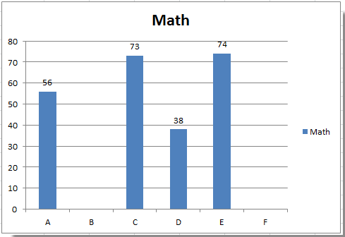
บางครั้งคุณอาจเพิ่มป้ายกำกับข้อมูลในแผนภูมิเพื่อทำให้ค่าข้อมูลชัดเจนและชัดเจนยิ่งขึ้นใน Excel แต่ในบางกรณีแผนภูมิจะมีป้ายกำกับข้อมูลเป็นศูนย์และคุณอาจต้องการซ่อนป้ายกำกับข้อมูลที่เป็นศูนย์เหล่านี้ ที่นี่ฉันจะบอกวิธีที่รวดเร็วในการซ่อนป้ายกำกับข้อมูลศูนย์ใน Excel พร้อมกัน

ซ่อนป้ายกำกับข้อมูลที่เป็นศูนย์ในแผนภูมิ


ลูกศรสีฟ้าฟองขวา ซ่อนป้ายกำกับข้อมูลที่เป็นศูนย์ในแผนภูมิ

หากคุณต้องการซ่อนป้ายกำกับข้อมูลที่เป็นศูนย์ในแผนภูมิโปรดดำเนินการดังนี้:

1. คลิกขวาที่ป้ายกำกับข้อมูลรายการใดรายการหนึ่งแล้วเลือก จัดรูปแบบป้ายข้อมูล จากเมนูบริบท ดูภาพหน้าจอ:

doc-hide-zero-data-label-1

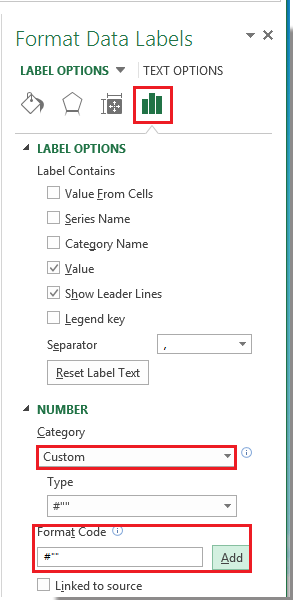
2 ใน จัดรูปแบบป้ายข้อมูล กล่องโต้ตอบคลิก จำนวน ในบานหน้าต่างด้านซ้ายจากนั้นเลือก กำหนดเองจากหมวดหมู่ กล่องรายการและพิมพ์ # "" เข้าไปใน รหัสรูปแบบ กล่องข้อความแล้วคลิก เพิ่ม เพื่อเพิ่มเข้าไป ชนิดภาพเขียน กล่องรายการ ดูภาพหน้าจอ:

doc-hide-zero-data-label-2

3 คลิก ปิดหน้านี้ เพื่อปิดกล่องโต้ตอบ จากนั้นคุณจะเห็นป้ายกำกับข้อมูลศูนย์ทั้งหมดซ่อนอยู่

doc-hide-zero-data-label-3

ปลาย: หากคุณต้องการแสดงป้ายกำกับข้อมูลที่เป็นศูนย์โปรดกลับไปที่กล่องโต้ตอบ Format Data Labels แล้วคลิก จำนวน > ประเพณีและเลือก #, ## 0; - #, ## 0 ใน ชนิดภาพเขียน กล่องรายการ

หมายเหตุ: ใน Excel 2013 คุณสามารถคลิกขวาที่ป้ายกำกับข้อมูลและเลือก จัดรูปแบบป้ายข้อมูล เพื่อเปิด จัดรูปแบบป้ายข้อมูล บานหน้าต่าง; จากนั้นคลิก จำนวน เพื่อขยายตัวเลือก คลิกถัดไป หมวดหมู่ แล้วเลือกไฟล์ ประเพณี จากรายการแบบหล่นลงและพิมพ์ # "" เข้าไปใน รหัสรูปแบบ กล่องข้อความแล้วคลิกไฟล์ เพิ่ม ปุ่ม

doc-hide-zero-data-label-4


บทความญาติ:

สุดยอดเครื่องมือเพิ่มผลผลิตในสำนักงาน

🤖 Kutools AI ผู้ช่วย: ปฏิวัติการวิเคราะห์ข้อมูลโดยยึดตาม: การดำเนินการที่ชาญฉลาด   |  สร้างรหัส  |  สร้างสูตรที่กำหนดเอง  |  วิเคราะห์ข้อมูลและสร้างแผนภูมิ  |  เรียกใช้ฟังก์ชัน Kutools...
คุณสมบัติยอดนิยม: ค้นหา เน้น หรือระบุรายการที่ซ้ำกัน   |  ลบแถวว่าง   |  รวมคอลัมน์หรือเซลล์โดยไม่สูญเสียข้อมูล   |   รอบโดยไม่มีสูตร ...
การค้นหาขั้นสูง: VLookup หลายเกณฑ์    VLookup หลายค่า  |   VLookup ข้ามหลายแผ่น   |   การค้นหาที่ไม่ชัดเจน ....
รายการแบบเลื่อนลงขั้นสูง: สร้างรายการแบบหล่นลงอย่างรวดเร็ว   |  รายการแบบหล่นลงขึ้นอยู่กับ   |  เลือกหลายรายการแบบหล่นลง ....
ผู้จัดการคอลัมน์: เพิ่มจำนวนคอลัมน์เฉพาะ  |  ย้ายคอลัมน์  |  สลับสถานะการมองเห็นของคอลัมน์ที่ซ่อนอยู่  |  เปรียบเทียบช่วงและคอลัมน์ ...
คุณสมบัติเด่น: กริดโฟกัส   |  มุมมองการออกแบบ   |   บาร์สูตรใหญ่    สมุดงานและตัวจัดการชีต   |  ห้องสมุดทรัพยากร (ข้อความอัตโนมัติ)   |  เลือกวันที่   |  รวมแผ่นงาน   |  เข้ารหัส/ถอดรหัสเซลล์    ส่งอีเมลตามรายการ   |  ซุปเปอร์ฟิลเตอร์   |   ตัวกรองพิเศษ (กรองตัวหนา/ตัวเอียง/ขีดทับ...) ...
ชุดเครื่องมือ 15 อันดับแรก12 ข้อความ เครื่องมือ (เพิ่มข้อความ, ลบอักขระ, ... )   |   50 + แผนภูมิ ประเภท (แผนภูมิ Gantt, ... )   |   40+ ใช้งานได้จริง สูตร (คำนวณอายุตามวันเกิด, ... )   |   19 การแทรก เครื่องมือ (ใส่ QR Code, แทรกรูปภาพจากเส้นทาง, ... )   |   12 การแปลง เครื่องมือ (ตัวเลขเป็นคำ, การแปลงสกุลเงิน, ... )   |   7 ผสานและแยก เครื่องมือ (แถวรวมขั้นสูง, แยกเซลล์, ... )   |   ... และอื่น ๆ

เพิ่มพูนทักษะ Excel ของคุณด้วย Kutools สำหรับ Excel และสัมผัสประสิทธิภาพอย่างที่ไม่เคยมีมาก่อน Kutools สำหรับ Excel เสนอคุณสมบัติขั้นสูงมากกว่า 300 รายการเพื่อเพิ่มประสิทธิภาพและประหยัดเวลา  คลิกที่นี่เพื่อรับคุณสมบัติที่คุณต้องการมากที่สุด...

รายละเอียด


แท็บ Office นำอินเทอร์เฟซแบบแท็บมาที่ Office และทำให้งานของคุณง่ายขึ้นมาก

  • เปิดใช้งานการแก้ไขและอ่านแบบแท็บใน Word, Excel, PowerPoint, ผู้จัดพิมพ์, Access, Visio และโครงการ
  • เปิดและสร้างเอกสารหลายรายการในแท็บใหม่ของหน้าต่างเดียวกันแทนที่จะเป็นในหน้าต่างใหม่
  • เพิ่มประสิทธิภาพการทำงานของคุณ 50% และลดการคลิกเมาส์หลายร้อยครั้งให้คุณทุกวัน!
Comments (15)
No ratings yet. Be the first to rate!
This comment was minimized by the moderator on the site
Muito obrigado!
This comment was minimized by the moderator on the site
Depending on your data set, you could use a helper column. The formula could use rounddown or IF(cell<1,0,cell). This way your slicers stay intact and your pie chart uses the new column.
This comment was minimized by the moderator on the site
I have a pivot chart (pie chart) where I need to remove the labels for any slice of the pie with a value under 1%. Right now, these are displayed as 0% (no decimal places). I am also using slicers to analyse the data by month, department and person. I am trying to get the chart to hide any labels where the value is less than 1%, but this will change when I change the variables in the slicers. I have fallen down a rabbit-hole here trying to figure this out.
This comment was minimized by the moderator on the site
The Microsoft way of doing it (though not found on ana MS help page) is to click File>Options>Advanced, scroll down to 'Display options for this worksheet', and uncheck / untick 'Show a zero in cells that have a zero value'. All the zeros disappear.

I seem to have found a way to remove the axis name and space on a graph or chart for zero values: Highlight the whole table, click Home>Sort and filter>Filter, Click on the header of the column with the blank zero values, and uncheck / untick 'Blanks'.
This comment was minimized by the moderator on the site
Thanks that really works well for me.
This comment was minimized by the moderator on the site
tnx, it works
This comment was minimized by the moderator on the site
How can I hide Zero Data Labels when it is percentage (for example 0,00%, I do not want that label to be shown)?
This comment was minimized by the moderator on the site
<span style="letter-spacing: 0.2px; color: inherit; font-family: inherit; font-style: inherit; font-variant-ligatures: inherit; font-variant-caps: inherit; font-weight: inherit;">0.0%;-0.0%;""    </span>
This comment was minimized by the moderator on the site
Hi
Thank you for sharing the solution above. It was really great help. However, after hiding zero values, I am having difficulties with hiding their labels. Can you please give a solution for that problem, too? Thank in advance for your help.
This comment was minimized by the moderator on the site
Found this solution absolutely useful. Thanks a ton.
This comment was minimized by the moderator on the site
Great solution! Can this be done retaining decimal points on the numbers that do appear?
This comment was minimized by the moderator on the site
Kelcey, use: #,##"";-#,##""; When using the second semicolon, you define what happens in case of zero. So, if you don't define anything, the value stays blank.
This comment was minimized by the moderator on the site
I use 0.0;;; and it also does the trick, in terms of retaining decimal places. You'd just adjust to the # of sig figs you want to keep. You have to assign the custom value to each data label series, but it keeps that format each time you refresh the data.
There are no comments posted here yet
Load More
Please leave your comments in English
Posting as Guest
×
Rate this post:
0   Characters
Suggested Locations